 The Prince Estate, along with Pantone Color Institute™, announced earlier this month the creation of a standardized custom color to represent and honor the international icon, Prince. According to an article from CNN, Prince has been honored with his very own Pantone purple shade.
The article explained that Pantone had created a new color, Love Symbol #2. According to Laurie Pressman, Vice President of the Pantone Color Institute, the color was “inspired by Prince’s custom-made Yamaha purple piano.”
Pantone and its ink matching system date back even further than the roots of Westamerica Communications. Twelve years before my father opened the Printing Company Lawrence Herbert, Pantone’s founder, created a system to identify and match colors so they could be faithfully reproduced.
Here we are 40+ years later and I can still remember walking through my father’s shop and seeing Pantone books sitting on tables next to the printing presses. If you walk through our pressroom today you’ll find the latest editions of those books sitting right next to our presses.
To be “consistently replicated”
A quote from Pressman in the CNN article jumped out at me. She said. “Love Symbol #2 enables Prince’s unique purple shade to be consistently replicated and maintain the same iconic status as the man himself.”
Those words “consistently replicated” started me thinking about sea snails.
The meaning behind the color
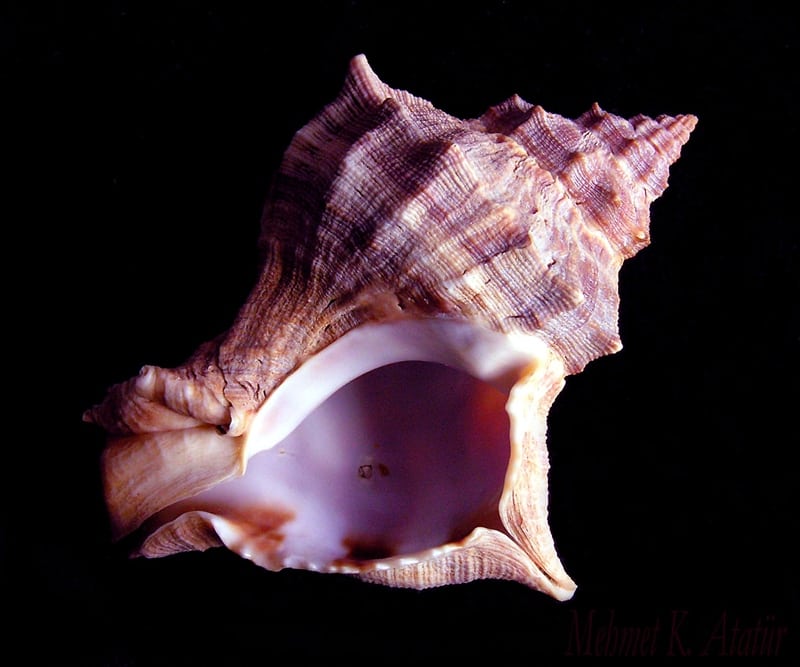 For centuries the color purple has been associated with royalty. In large part, this is due to the expense associated with the dyes of the color itself. Until the mid-1800s the only way to produce the purple dye was to collect it from small sea snails* found off the coast of what is now modern-day Lebanon.
It was also difficult to dye the fabric in an even, consistent way. When the emperor ordered a toga or the queen ordered a purple gown you better make sure the colors were consistent and the product looked good.
The truth is, consistent color output, whether it be a Pantone color, CMYK, or any other color, across all devices and types of printing equipment may cause some operators sorrow and pain.
The ability to consistently replicate color
The Pantone system lists specific colors to mix together to create a certain Pantone color. For example, with Love Symbol #2, there are no CMYK values that can be mixed to create this color. If this color is to run on a press for a specific client the ink must be mixed by an ink technician, like our in-house technician Daniel. But this is only the beginning.
Once the ink is mixed it then must be applied to the substrate. This means you’re running it on an offset press like our new Komori GL640. But it takes more than a fancy new press to consistently reproduce accurate color across a brand owner’s multiple product lines.
The importance of training and certification
In order to create consistent color, your technicians must be trained and certificated. You can’t just “eyeball” color. Clients and brand owners have come to expect precision-quality color.
While offset presses, wide format printers or digital presses can’t be certified, your people can be. At Westamerica we’ve implemented G7 training. Our press operators and digital technicians have learned that controlling the tonality and gray balance of every press run to G7 specifications ensures consistency in the initial print run and in subsequent runs. Each additional run will have very similar visual appearance–even months or years later. And our G7 Professionals and G7 Experts qualify for G7 Master status on an annual basis.
A brand owner looking to produce a marketing campaign with print collateral created by offset press, signage created with a wide format printer and direct mail printed on a digital press using variable data, can be assured that, due to G7 training and certification, their project will receive the highest production quality possible.
So whether you’re looking to match the color of that Little Red Corvette or your Raspberry Beret, whether you’re using Pantone’s Love Symbol #2 or creating your colors using CMYK, making sure your colors are consistently replicated which requires trained and certified technicians.
* Murex brandaris shell photo credit: Mehmet Atatur