Have you ever looked at a word and wondered, “Why is it spelled like that?” I understand “I” before “E” except after “C,” but why? Who said so? I’m sure there’s a group of linguists out there who would gladly explain all of this to me, but I think I’ll take a pass.

When you think about it, a dictionary is just a wordbook that someone compiled to make sure we all spelled words the same way. It was a way to standardize the language.
Standardization is essential in many areas of life. For example, you know you’re placing an envelope in the appropriate box because you recognize the FS 15050 blue of a USPS mailbox. And, you know you’re on an interstate highway because you recognize the FS 14115 green of the exit sign on the freeway. Both of these colors are part of the Federal Standard 595 color description and communication system developed in 1956 by the United States government.
Color Standardization
Here at Westamerica Communications, we, too, use a color standard to measure the work we produce. If you’ve met with our graphic designers or walked through our printing facility, you’ve no doubt seen the Pantone® color swatch books we use to standardize our color reproduction. Standardization leads to consistency. These books make sure that both our clients and employees agree that Pantone 185 is really the spot color that belongs on a particular piece of print collateral.
Color Dictionaries
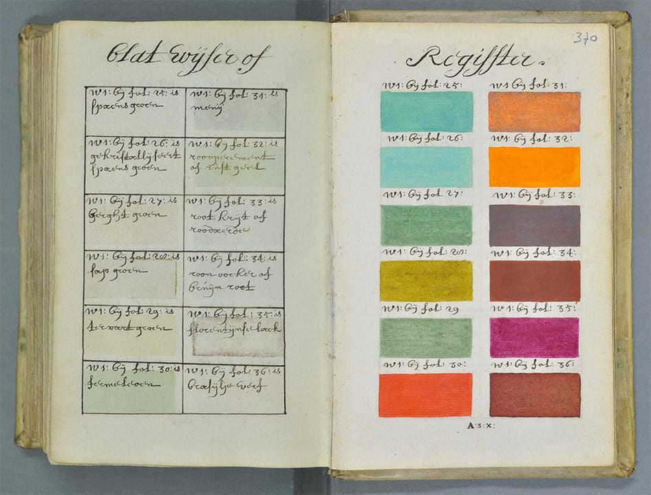
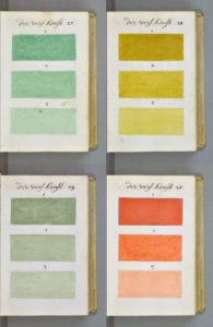
It may interest you to know that over 250 years before Pantone® created their color swatch books a Dutch artist by the name of A. Boogert detailed every color in the spectrum in an 800+ page color dictionary called, Traité des couleurs servant à la peinture à l’eauonly. And he did it all by hand.
 The book, written in 1692, was intended as an educational guide and contained information on mixing watercolors. At the beginning of the book, Boogert explained the use of color in painting and went on to demonstrate how to create certain hues and change the tone by adding one, two, or three parts of water.
According to historian Daniel Lewis, Chief Curator of Manuscripts at The Huntington Library, Art Collections, and Botanical Gardens, “Color dictionaries were designed to give people around the world a common vocabulary to describe the colors of everything from rocks and flowers to stars, birds, and postage stamps.”
Mineralogist Abraham Gottlob Werner created his own color dictionary that attempted to create a standardized system of color identification. He devised a standardized color scheme that allowed him to describe even the subtlest of chromatic differences with consistent terminology. Werner’s Nomenclature of Colours was first published in 1814. The rich handwritten descriptions included examples of where each color could be seen in animals, vegetables, and minerals. The book is a delight to read. Colors like Arterial Blood Red, Sap Green, and Velvet Black are found within its pages.
Patrick Syme, an Edinburgh flower painter, created color charts to update Werner’s book. He used minerals that Werner had described in his book to create the color charts.
This 1814 color dictionary has now been republished by Smithsonian Books as a pocket-sized guide. You can get your copy by clicking here.
So, whether you’re looking for the right word to use in a blog or the right color for a printed piece, it’s good to know there’s a dictionary to keep us all on the same page.
