Originally posted by Fontyou.
Credit to Diane Pellotieri for illustrations, writer Valentine Proust, and Fontyou
Typography needs moral but mostly aesthetic instructions. Here is a list of 10 Commandments of Typography, rules to follow and tips to know to be a better person, or at least a better graphic designer!
1. You shall not deform
There are so many font families with several weights and styles, so why do you persist in bolding, condensing or small-capsing by hand, guys?
If you need something bold or light, choose a font with several weights, but please don’t just add an outline, you have 99,9% chance to damage the letter design (counterforms, serifs, endings etc).
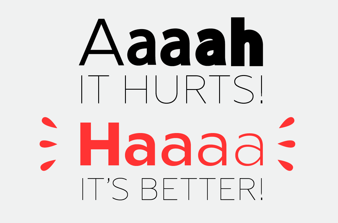
Same things about widths. We know that designers use to change width manually to save some space (don’t play the innocent). Why don’t you choose a condensed or ultra condensed font? If you simply reduce the width, contrats between verticals and horizontals will be ugly. See it by yourself :
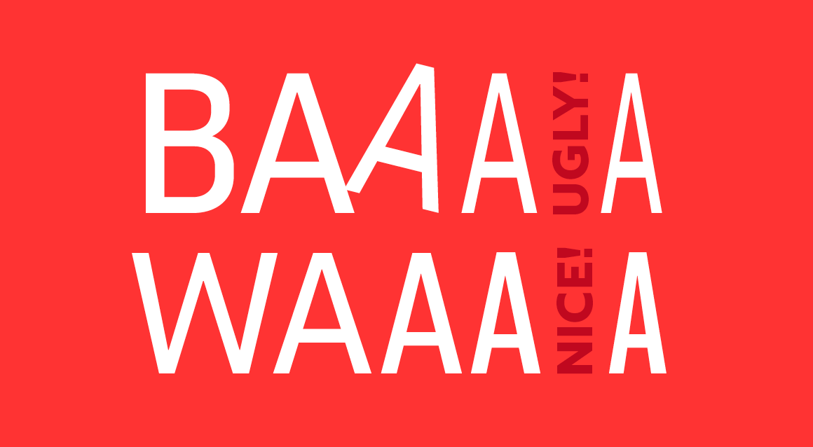
If you didn’t know, a real small-cap has a specific design, it’s not only an uppercase which have been reduced. If you shrink an uppercase to fit with the x-height, you’ll damage contrasts (so choose a font with small caps). See how it hurts :
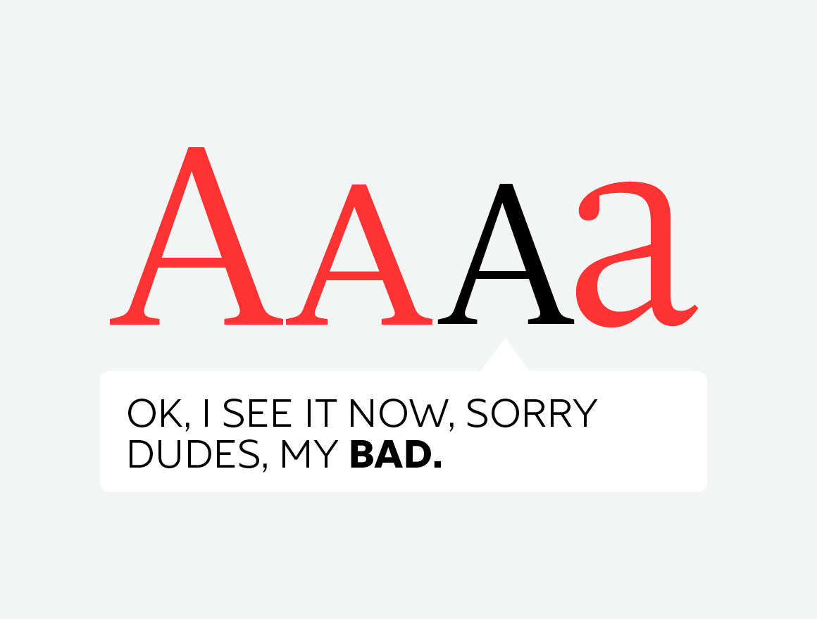
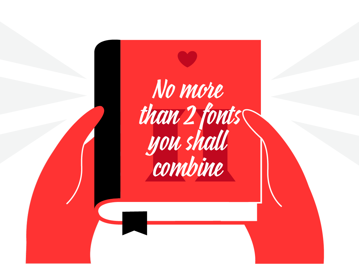
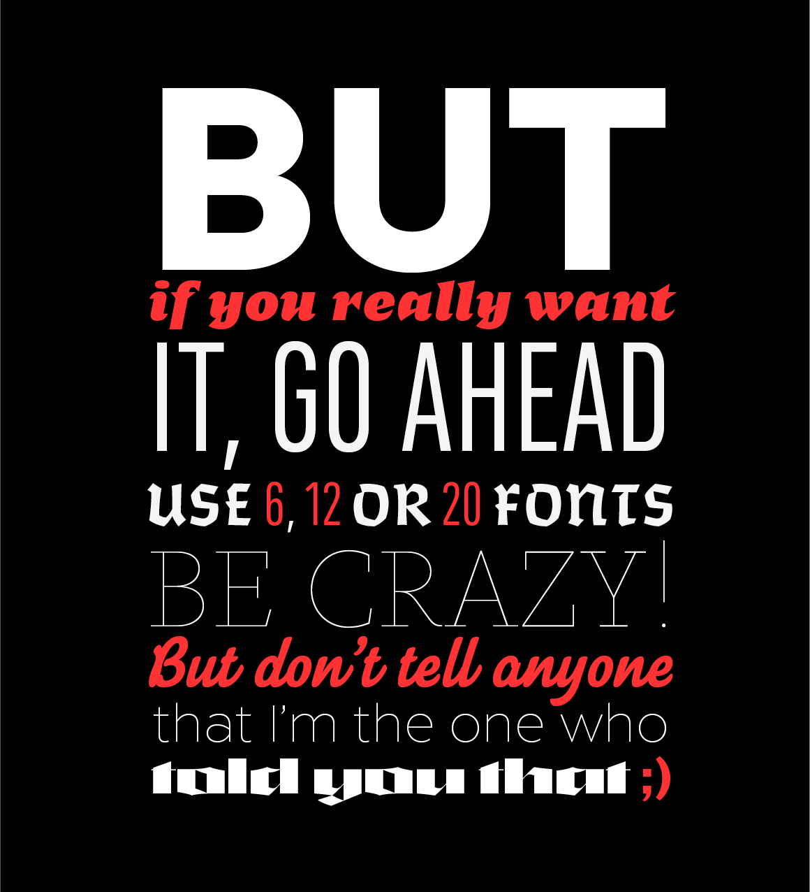
2. No more than 2 fonts family you shall combine
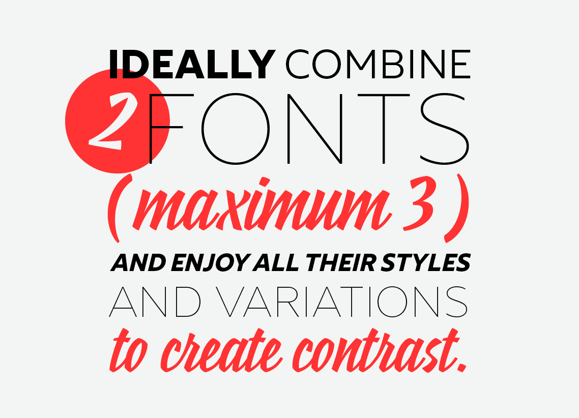
Ideally, combine 2 typefaces, (maximum 3) and enjoy all their styles and variations to create contrasts.
For example, choose a serif font and a sans serif font and play with weights, italics, small caps etc.
Avoid to combine two fonts of the same family, and always remember that contrast is the key.
3. Too short or too long lines you shall avoid
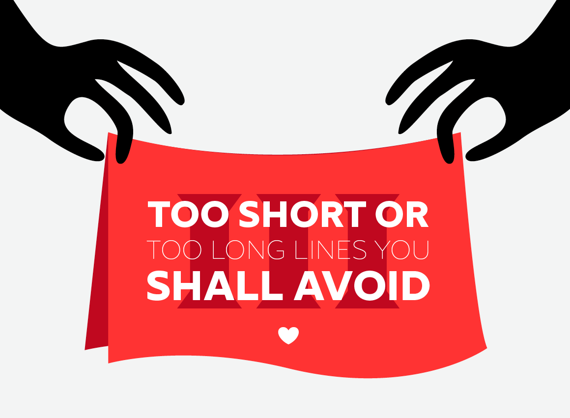
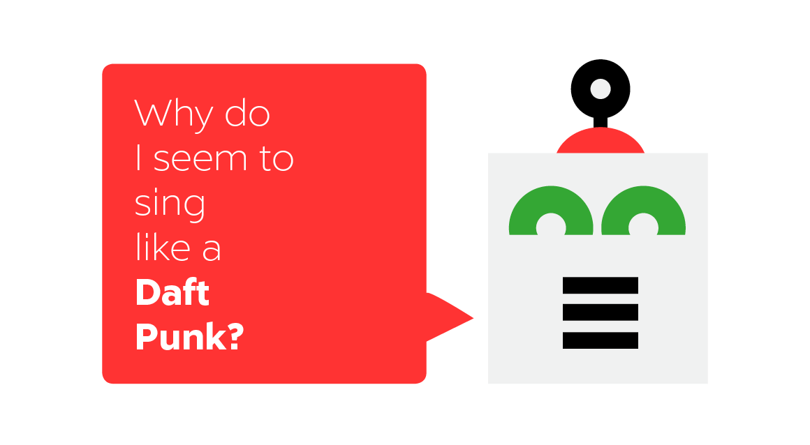
The lines lenght considerably influences the reading and the understanding of the meaning itself. Short lines will provoque a jerky reading while too long ones will strain your eyes.
Too short:
Too long:
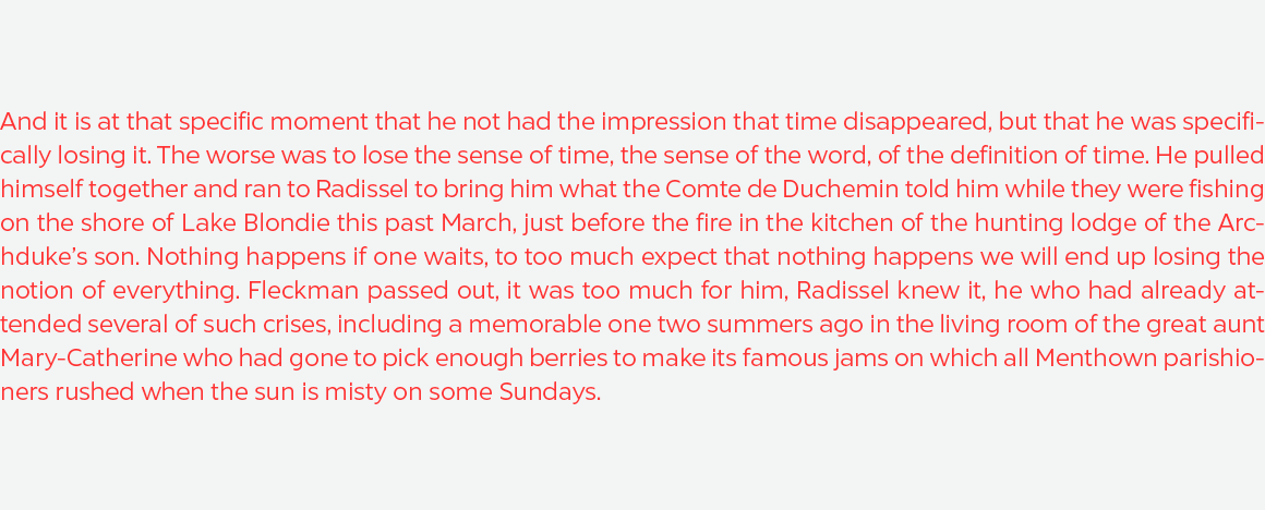
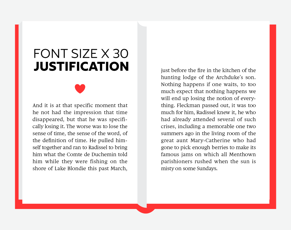
A simple way to calculate the justification is to use the method of Robert Bringhurst, which multiplies the font size by 30. If the font size is 10px, multiply it by 30 gives you a justification for 300px or about 65 characters per line.
4. Good rules of composition you shall apply
The automatic justification of a text can generate some composition aberrations (unequal spaces between words, rhythm problems, unbalanced typographic color…).
So you’ll have to change some settings to get a better color of text.
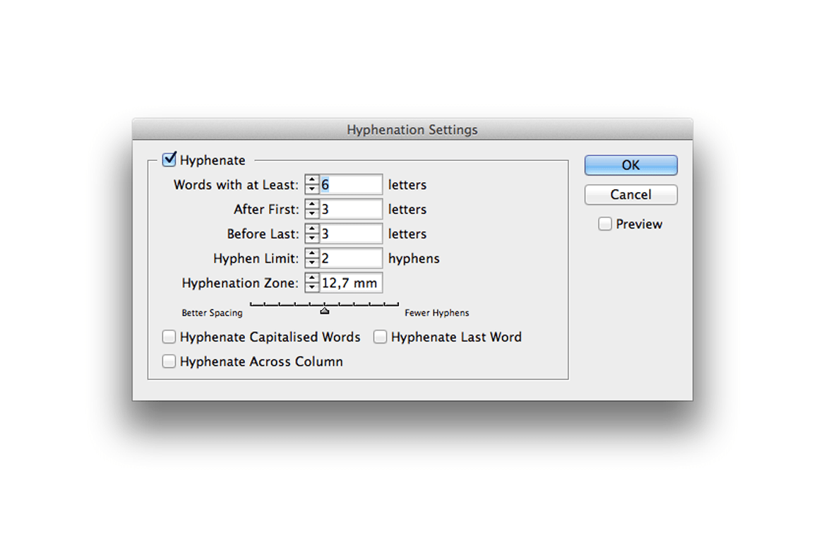
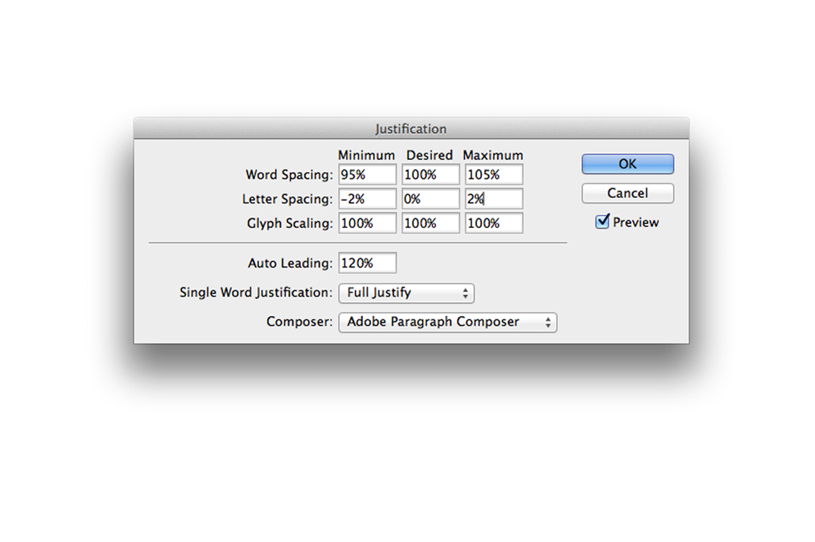
Justification is about the letters distribution on the lines. You can adjust the space between words and between letters. Hyphenation is about if, how and when words can be hyphenated.
Here are some basic settings for optimized composition (Valentine’s habits, but everyone has its favorite ;). Ideally you have to adjust the settings for each font, depending on its width:
Line breaks are essential too for a good composition.
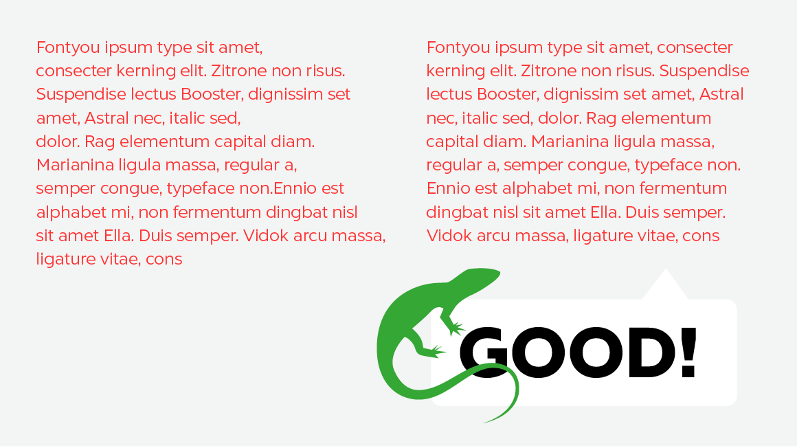
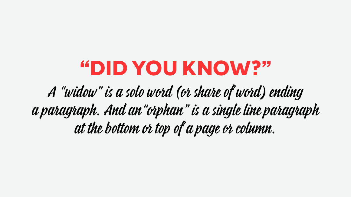
If you choose to compose a left justified text, you should shape your lines in order to have a beautiful text color. Avoid too short lines and provoque line breaks. Be aware of widows and orphans (see definitions below).
5. Of fake friends you shall beware

The apostrophe should not be confused with the prime symbol (minute). You can get the “real apostrophe” with [Alt Shift 4].
The double quote mark should not be confused with the double prime (second). You can get “english” quote marks with [Alt 3] and [Alt Shift 3]. And «french» quote marks with [Alt 7] and [Alt Shift 7].
As for the ellipsis, you can get it with [Alt .], and not “dot dot dot”!
There are also keyboard shortcuts for œ [Alt o] and æ [Alt a].

6. Accents on uppercases you shall put

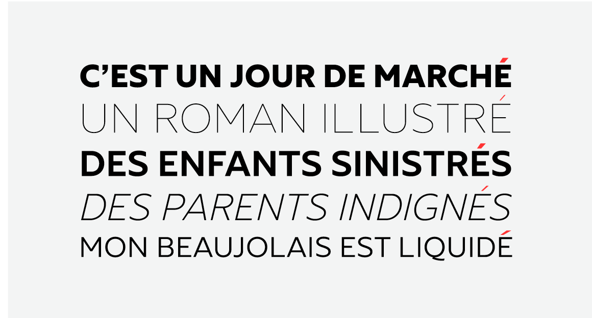
We already talked about this here, but the topic is so important that it needs to be part of the top 10 of Type Commandments. Actually no accents on uppercases, it’s like … no accents on lowercases. We don’t need metaphor, we need comprehension!
7. Abbreviations you shall learn
Abbreviations are cute little and practical things to know. Here is a table that shows some English and French practical abbreviations. There are of course many others, that I invite you to learn by heart asap :).
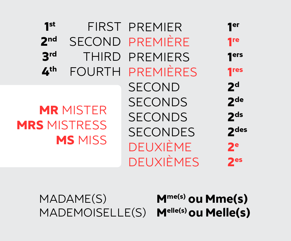
And MM. is not for Mickey Mouse but for Messieurs (and so M. for Monsieur).
8. Spaces you shall respect
In French, there is a thin space (espace fine insécable) before every punctuation composed of 2 signs
(?!; etc).
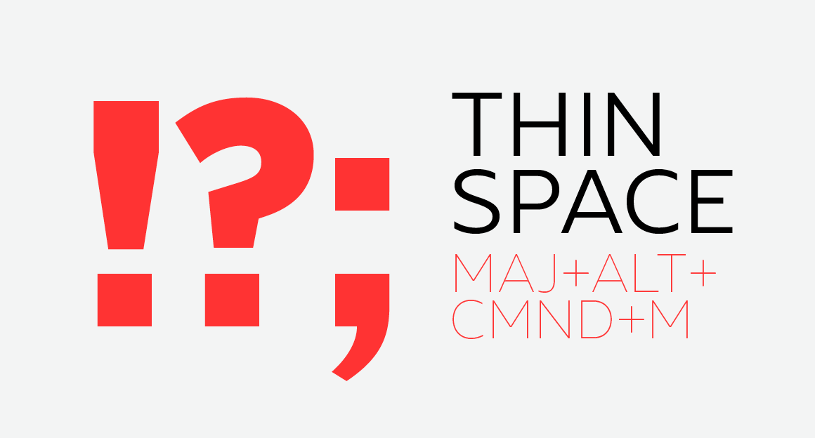
Good to know too:
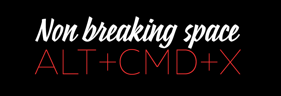
In English, there are no spaces before punctuation. Easy!
9. Fonts you shall respect
Fonts are like baby animals, rare pearls and protected natural species, you must take care of them and show them some r-e-s-p-e-c-t. There are people in the world who spend their days (and often their nights, week-ends, family holidays…) to think, draw, and make fonts. Think of them, respect their work (and lives). And there are fonts on the world wide web that you can buy or get for free, licenses are the keys of possession. Fonts are precious, but not in a Gollum way.
10. This fonts you shall never use
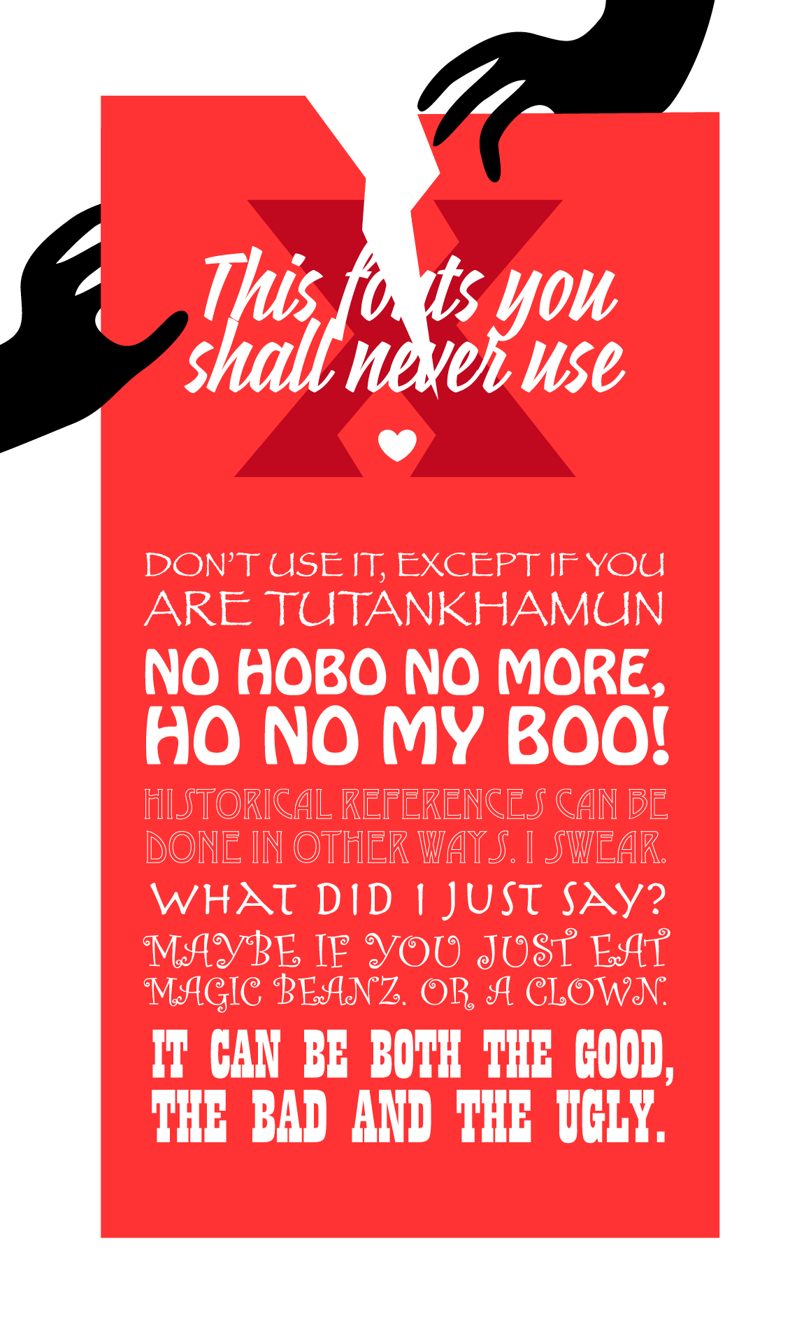
This is not an order, this is just a best friend advice!
Illustrations by Diane Pellotieri.

