 Well, it’s official. After months of talking about the advantages of wide and grand format printing, we’ve pulled the trigger and opened Westamerica’s Display Graphics Division. So, what better way to announce the opening of our new facility in Irvine than a party. And not just any party, an Endless Summer Party!
The party was both a celebration and a promise. The event celebrated good clients, supportive vendor partners, and friends and family. It was meant to be an expression of gratitude to those who have helped us become who we are today.
In addition, it was a promise of even greater things yet to come as we continue to invest in capabilities that are important to our clients.
The Fun Team
In late Spring 2018, just after the acquisition of our new 10-foot fabric printer, the Impres™ 4320, we looked for ways to alert our clients to the new and varied capabilities of our wide and grand format printing equipment. We used conventional means of communication such as emails, blogs, and social media. Our sales reps discussed our new capabilities with their clients. However, to truly visualize the marketing and branding opportunities possible with wide and grand format printing, you have to see it in person.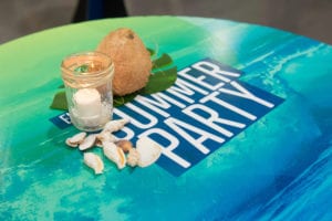
You can try to describe it, but it’s not until you’re standing next to an 18-foot long by 8-foot high dye sublimation image mounted to an aluminum frame, backlit by LED lights, that you can truly appreciate the visual impact of a grand format print.
So last spring, we challenged our Fun Team to create an event that would be both fun and educational. The Fun Team is a group of volunteers at Westamerica who work together with our creative team to put together internal events for our employees and outward facing events for our clients. They came up with an Endless Summer themed party.
Our new facility in Irvine houses some fantastic wide and grand format capabilities. Once our Fun Team became familiar with what the equipment could do, they went to work on designing some colorful and creative summer themed graphics.
The Endless Summer Party
As visitors arrived at the party, they were greeted at a tent with two ten foot high and half inch thick palm trees. Between the two trees was a sign reading Endless Summer. The team had created and printed these trees on our Vutek LX3250. This machine can print on materials up to two-inches thick. They then used the Colex router to cut out the trees to create a freestanding display.
Keeping with the tropical summer theme, as visitors entered the production room, they walked on floor graphics with images of sand on the beach and water with a dock. These were also printed on our Vutek LX3250.
Once inside, visitors enjoyed tropical themed food and drink while standing at custom printed cocktail tables. Others tried their hand at a bean bag toss game with custom printed cornhole platforms.
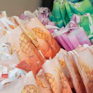 In addition to signage, our team created gifts for each of our visitors. These, too, were produced on our equipment.
Taking advantage of the printing and sewing capabilities of our new equipment, the team created custom designed Endless Summer shopping bags. Inside the bags were gifts that were also created at Westamerica’s Design Graphics Division. With the help of our structural design team, the Fun Team created small custom printed treasure boxes with chocolates inside. These were a great way to highlight our Colex Cutter and structural building capabilities.
The gift bags also contained stress balls in the shape of a pineapple. Each of the stress balls had a tag outlining our promotional products capabilities.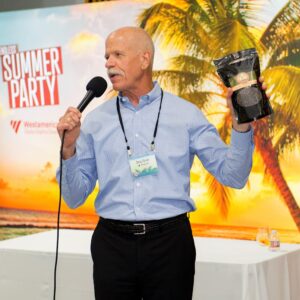
There were many activities that made this event special. Thanks to the generosity of our vendor partners, our guests were able to participate in hourly door prize drawings. And the grand prize was, of course, a bag of Doug’s Beans, coffee beans home roasted by yours truly.
Our Special Visitors
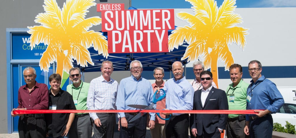
Earlier in the day, we were honored to have Brian Star, President and CEO of the Irvine Chamber of Commerce, along with Jessica Welch, SR Director of Operations, and Danielle Spellman, Membership Services Manager, who helped us with our ribbon-cutting ceremony, complete with bright red ribbon and a large pair of scissors.
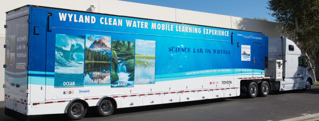
We were especially honored to have Michael-Anne Vasquez from the Wyland Foundation as our guest speaker. Our relationship with the Foundation stretches back years. We believe in their mission to help children and families around the nation discover the importance of healthy oceans and waterways.
One way the foundation spreads the word is with their large semi-trailer mobile learning center. We were fortunate enough to have it on site that day to help draw attention to the work done by the Wyland Foundation. In addition, we made a sizeable donation to the foundation.
 A Learning Experience
I feel the event was a big success. Our primary goal was to introduce our clients to our new wide and large format printing capabilities. I know when clients see these new marketing opportunities first hand they are inspired. As I walked through the event, I heard people discussing how they could use floor graphics, wall graphics, and frosted images on glass walls in their environment and with their clients.
Visitors were also impressed with our fabric printing capabilities. They were talking with one another about the advantages of fabric over traditional wide format substrates like vinyl.
It was also interesting to hear current clients say, “I didn’t know you guys did that?” It’s funny, in our industry, we see a constant evolution of graphics capabilities. Yet, with all the promotion and marketing we do, sometimes it takes an “in person” event to impress upon a client the many and varied marketing opportunities available in our industry.
 The book, written in 1692, was intended as an educational guide and contained information on mixing watercolors. At the beginning of the book, Boogert explained the use of color in painting and went on to demonstrate how to create certain hues and change the tone by adding one, two, or three parts of water.